
The Great Android Font Fix: Descenders Can Finally Descend in Peace
Sometimes, the most irritating software bugs are not the ones that crash an app or prevent a feature from working. They are the tiny visual problems that appear every time you open the app, read a message, or navigate a menu.
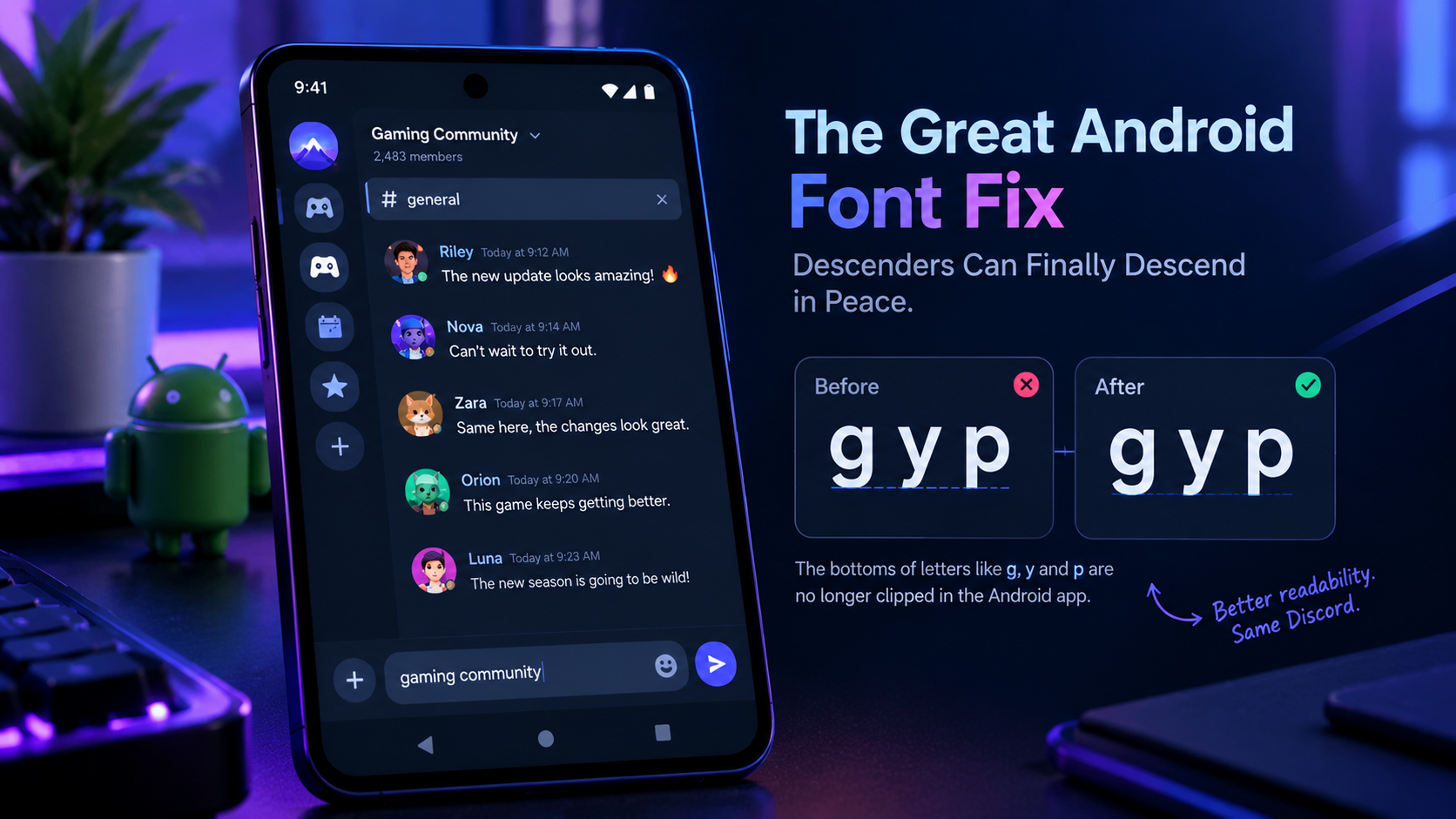
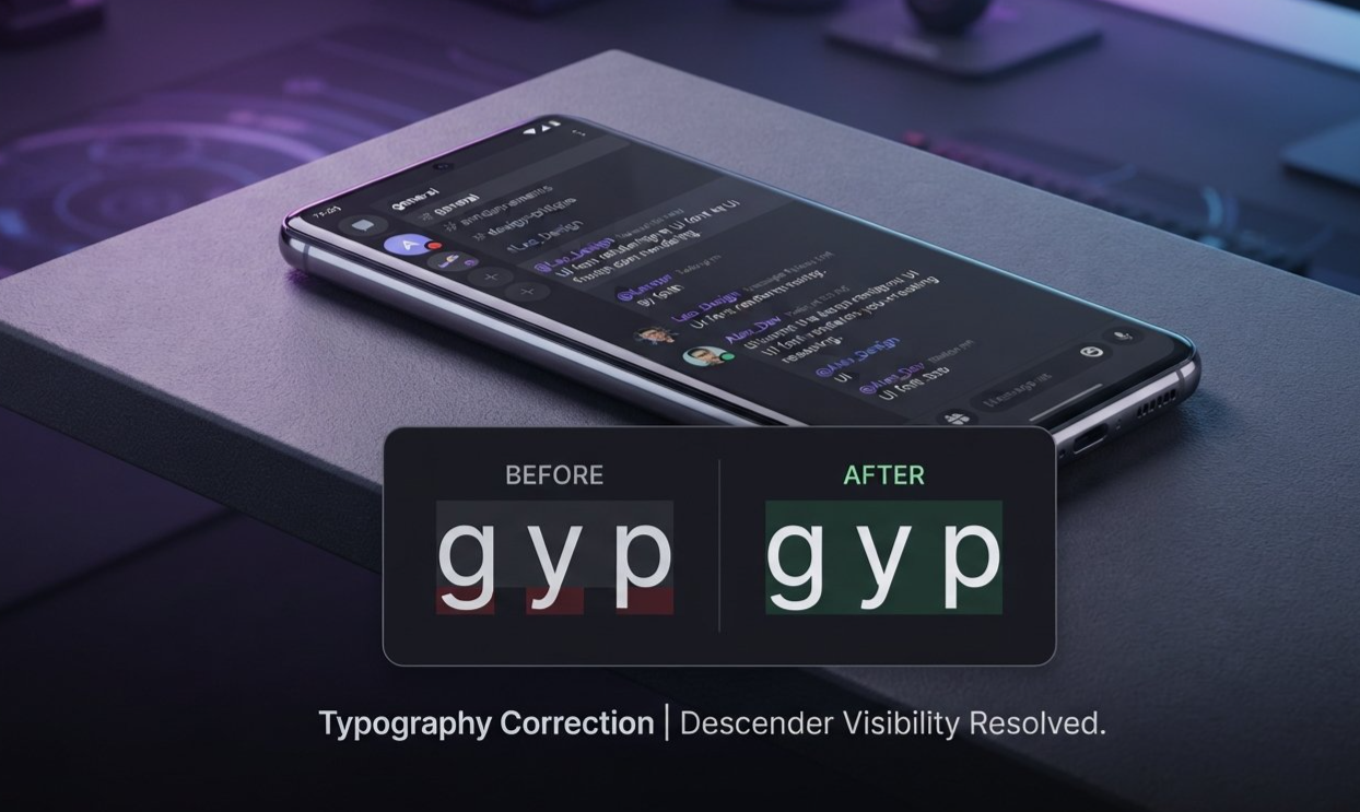
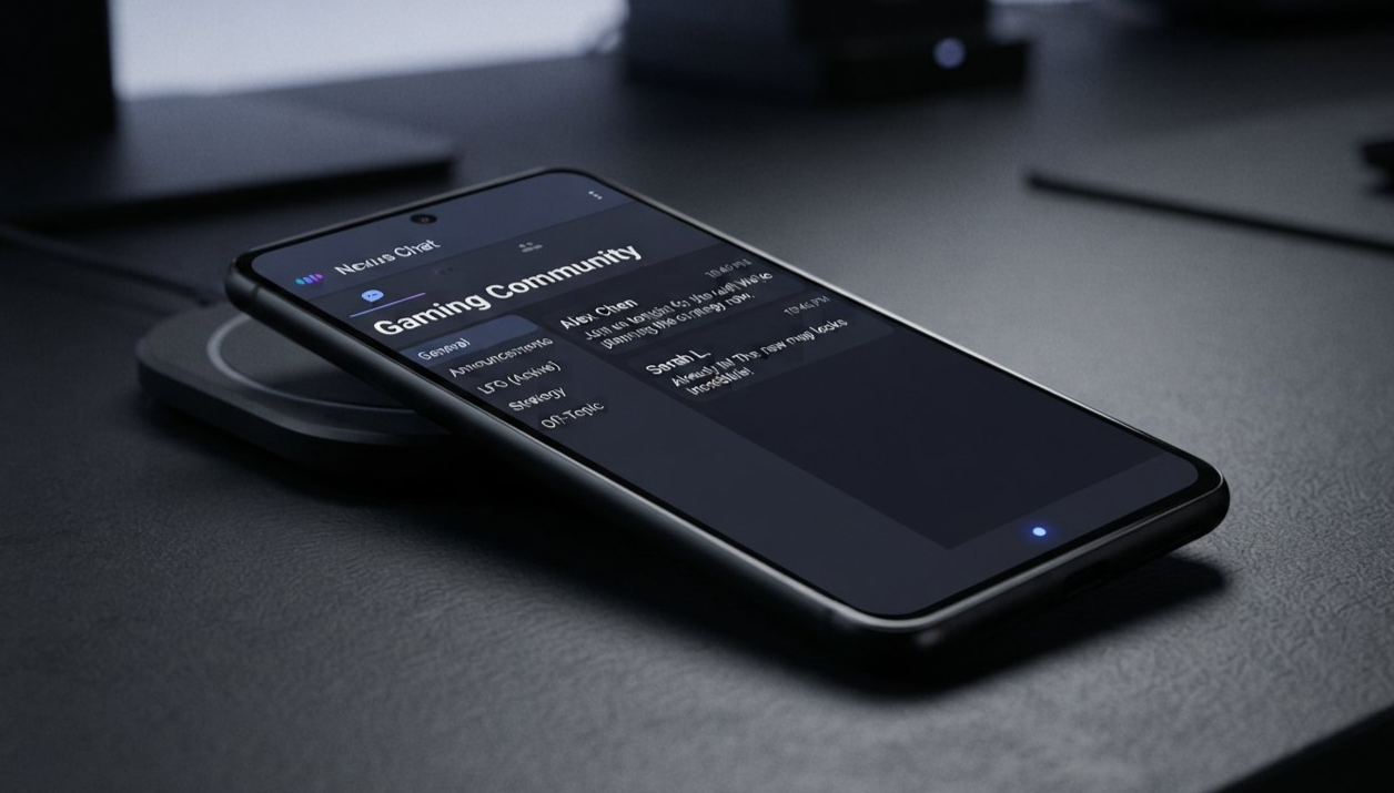
Discord's latest Android font fix addresses exactly that kind of annoyance. In its October 6, 2026 patch notes, Discord confirmed that it had resolved a bug that clipped the bottoms of letters such as g, y, and p in various places across the Android interface. The company even gave the fix a fitting description: descenders can now descend in peace.
It sounds like a minor change. After all, the letters were still mostly recognizable, and the app was not suddenly unusable. But text is one of the most important parts of a messaging platform. When the bottom of a character disappears, even slightly, the interface can feel unfinished and reading becomes less comfortable than it should be.
This update is a reminder that good user experience is not just about adding new features. Sometimes, it means making sure the letters on your screen look the way they were supposed to in the first place.
1. What Is the Android Font Fix?
The Android font fix is a bug correction listed in Discord's October 6, 2026 patch notes. According to the official changelog, the issue caused the bottoms of letters such as g, y, and p to be clipped in different parts of the Android user interface.
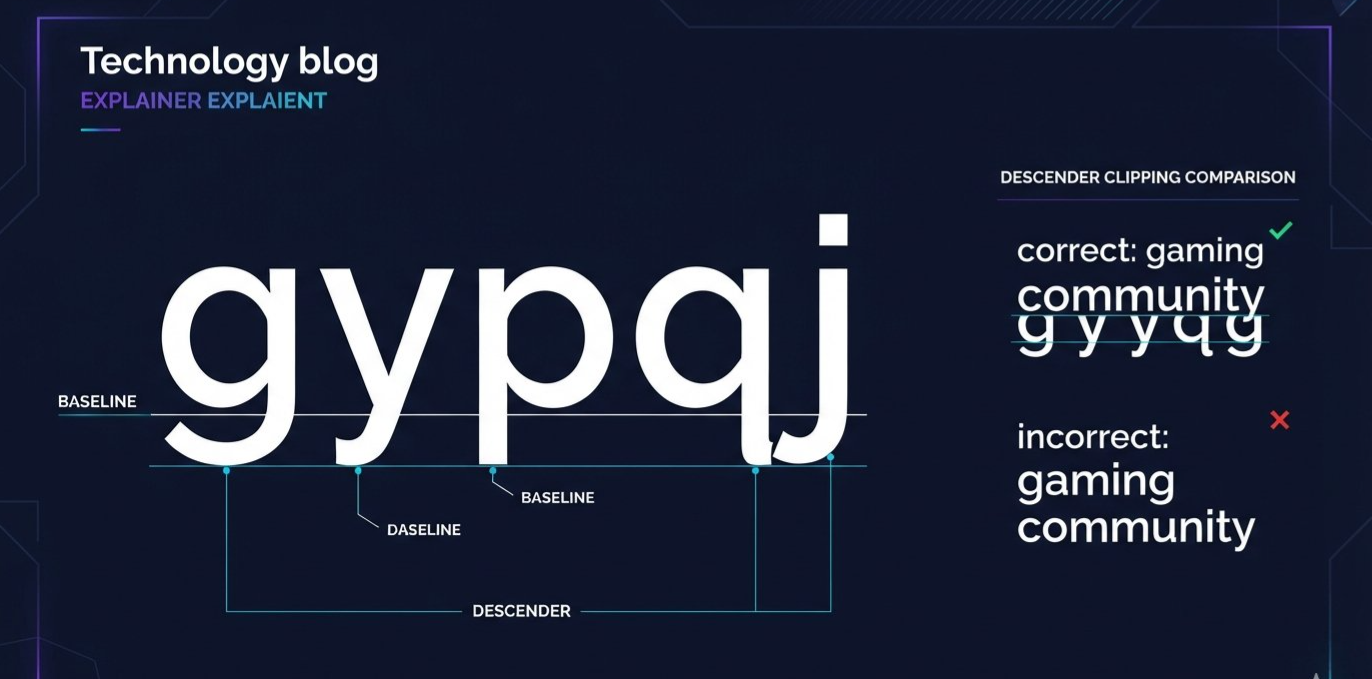
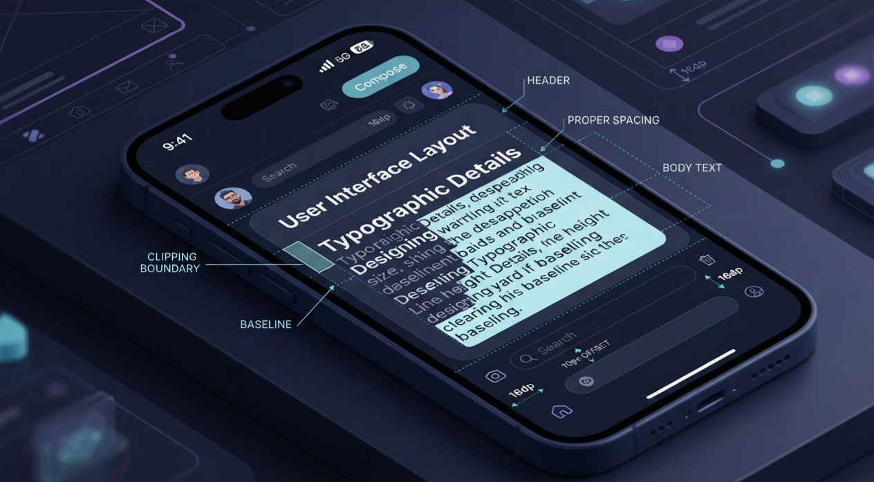
In typography, the parts of these letters that extend below the main writing line are called descenders. If the interface does not leave enough room to display them, the lower portions can appear cut off.
That is the problem this update addresses.
2. What Are Descenders, and Why Do They Matter?
Before getting into the impact of the fix, it helps to understand the typography behind it.
Most lowercase letters sit within a common vertical area known as the x-height. Some letters, however, extend below the baseline, the imaginary line on which most characters rest.
Common examples include:
g, as in gaming
y, as in community
p, as in people
q, as in quick
j, as in joining
The portion that extends below the baseline is the descender.
These shapes are not decorative extras. They are part of how letters are designed to be recognized. Remove part of a descender, and the character may still be understandable from context, but its shape is no longer complete.
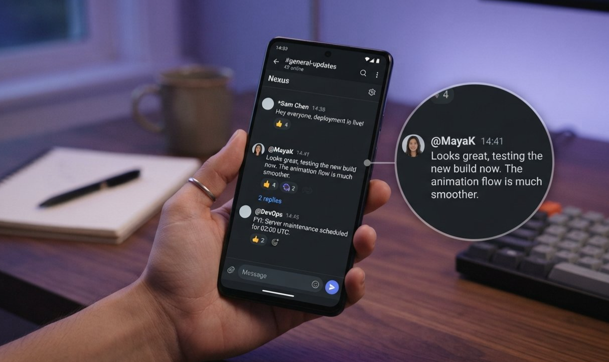
Consider the difference between a properly rendered message and one in which the lower portions of letters are missing. The second version can look cramped, inconsistent, or simply wrong. When it happens repeatedly, users may notice the visual defect even if they never learn the word “descender.”
3. How Clipped Letters Affect the Discord Experience
A clipped letter might not sound like a serious problem. It usually will not prevent someone from sending a message or joining a server. However, the quality of a user interface depends on thousands of details working together.
Readability comes first
The purpose of interface text is to communicate information quickly. Channel names, messages, labels, and buttons need to be easy to scan.
When parts of letters disappear, the text may become harder to read comfortably. The effect can be subtle, but it becomes more noticeable when it appears repeatedly across a screen.
Visual consistency matters
A well-designed interface should make its text feel consistent. Characters should have appropriate spacing, proportions, and vertical alignment.
If the bottoms of some letters are missing, the result can look like a font problem even when the actual typeface is not the cause. The interface may appear poorly aligned or unfinished.
Small defects become more noticeable over time
A user might overlook a visual glitch once. Seeing it every day is different.
Messaging apps are often opened frequently and used for long periods. Repeated imperfections can make an otherwise polished product feel less reliable. Fixing them helps the app maintain a consistent level of quality.
4. Why Typography Bugs Can Be Tricky to Fix
The October patch notes confirm the visible problem and its resolution, but they do not explain the underlying technical cause. Discord has not specified in this changelog whether the issue came from text-container sizing, font metrics, line height, clipping boundaries, or another implementation detail.
Still, typography bugs offer a useful example of how interface rendering can go wrong.
Text needs room to render
A line of text is not simply a row of identical boxes. Characters have different shapes and vertical extents. Some rise above the usual letter height, while others extend below the baseline.
If a text container or its clipping boundary does not accommodate the full character shape, part of the letter can disappear. This is one possible general explanation for a clipping defect, not a confirmed diagnosis of Discord's specific bug.
Mobile interfaces have many layouts
A modern mobile app contains different kinds of text components: message previews, navigation labels, settings descriptions, buttons, profile information, and more.
Each component may have different spacing and layout requirements. A rendering defect can therefore appear in multiple areas rather than being limited to one obvious screen.
Discord's wording that the issue affected “various places” in the Android UI suggests that the bug was not confined to a single named element. The changelog does not provide a complete list of affected locations.
A visual fix needs to preserve the rest of the layout
Correcting clipped letters is not just a matter of making every text box taller. A careless change could create extra spacing, alter alignment, or push nearby elements out of position.
The desired outcome is straightforward: display the full letter without disrupting the rest of the interface. The patch notes confirm the bug was resolved, although they do not disclose how Discord implemented the fix.
5. What the October 2026 Patch Actually Confirms
Discord's October 6 patch notes include several unrelated fixes across desktop, iOS, Android, chat, media, accessibility, and audio/video features.
The Android typography correction is one entry in a wider round of bug fixes. It should not be mistaken for a standalone redesign or a new customization feature.
Here is the confirmed scope of the change.
| Detail | What Discord confirms |
|---|---|
| Platform | Android |
| Problem | Bottoms of certain letters were clipped |
| Examples | g, y, and p |
| Affected area | Various places in the UI |
| Status | Listed as resolved in the October 6 patch notes |
| Technical implementation | Not detailed in the changelog |
| Separate font customization feature | Not announced as part of this fix |
The same changelog says that listed fixes had been committed and merged, but might still be rolling out to individual platforms when the post was published. That distinction matters: a fix can be documented in release notes before every user has necessarily received the relevant build.
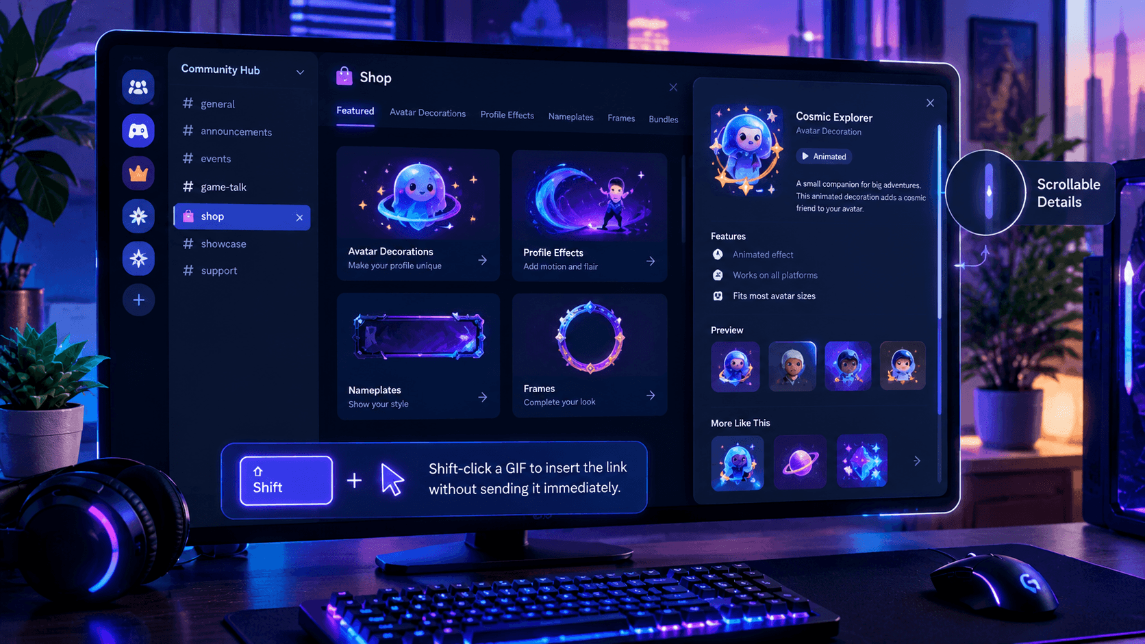
The patch notes also contain unrelated improvements, including a correction to a desktop Shop details window that could be cut off at certain sizes. That is a separate desktop issue, not part of the Android typography fix.
For the full list, read the official Discord October 6 patch notes.
6. What Android Users Should Expect
For users affected by the clipping issue, the expected result is simple: the lower parts of letters should appear correctly in the affected interface areas.
There is no new setting to enable described in the patch notes, and Discord did not announce a font switch or a user-facing typography control as part of this correction.
If the text still looks clipped on your device, a few practical checks may help:
Check for an app update. The changelog notes that fixes can roll out to individual platforms over time, so confirm that Discord is updated through the Google Play Store.
Restart the app. Fully close Discord and open it again to check whether the interface has refreshed.
Check whether the issue is limited to one screen. Note whether the problem appears in chat, previews, menus, or multiple areas.
Report a persistent issue. If the latest available version still clips letters, report the specific screen and device details through Discord's official support channels.
These are general troubleshooting steps, not a guarantee that they will resolve every display issue. The October patch notes do not specify a minimum Android version, device model, or exact app build number for this fix.
7. The Bigger Lesson About Mobile UI Design
The Android font fix highlights a principle that applies to almost every app: polish is not only about what users can do, but also about how reliably the interface presents information.
New features attract attention. A redesigned home screen makes a visible announcement. A major performance improvement may show up in benchmarks. Typography fixes are quieter, but they are still part of product quality.
Details shape trust
Users expect text to display properly. They rarely think about baselines, font metrics, or clipping regions until something looks wrong.
When an app corrects that defect, it removes a small distraction from the experience. That is valuable even if it does not deserve the same attention as a major feature launch.
Consistency matters across devices
Android apps must work across many devices, screen sizes, display settings, and configurations. A consistent interface should preserve the intended shape of text across the places where users interact with it.
The patch notes do not identify the precise cause of Discord's issue, so it would be premature to attribute it to one specific device, display density, or Android version. What is confirmed is that Discord identified and corrected a clipping bug in its Android UI.
Bug fixes are part of the product
A platform does not become polished only by adding features. It also improves by identifying small problems, correcting them, and making the everyday experience more dependable.
That is why this update deserves a mention. It is not a revolutionary change, but it is a concrete example of maintenance that improves the details users see every day.
8. Frequently Asked Questions
What is the Android font fix in Discord?
It is a bug fix documented in Discord's October 6, 2026 patch notes. It addresses a problem that clipped the bottoms of letters such as g, y, and p in different parts of the Android interface.
What are descenders in typography?
Descenders are the parts of lowercase letters that extend below the baseline. Common examples include the lower strokes of g, y, p, q, and j.
Does the update introduce a new font?
No new font was announced as part of this specific fix. The documented change corrects the clipping of existing letters.
Do users need to enable a setting?
Discord's patch notes do not list a setting that needs to be enabled. The fix is presented as a software correction.
Why might I still see clipped letters?
The October patch notes state that fixes may still be rolling out to individual platforms. If the problem persists, check for an available Discord update and report the affected screen if necessary.
Does this fix change Discord's entire Android design?
No. The changelog describes a typography-related bug fix, not a complete redesign of the Android interface.
Is the fix available on iOS too?
The specific clipping correction discussed here is listed under Android. The same patch notes include other independent iOS fixes, but this entry does not announce the same correction for iOS.
Where can I read the official announcement?
Read Discord Patch Notes: October 6, 2026 for the original description and other fixes included in the update.
9. Final Verdict: A Small Fix That Makes the Interface Feel Right
Discord's Android font fix is the kind of update that might not make headlines on its own, but it addresses a genuine interface flaw. When letters such as g, y, and p lose their lower strokes, text no longer looks quite right. Correcting that problem helps restore the consistency users expect from a modern messaging app.
The October 6, 2026 patch notes confirm that the clipping bug has been resolved, while leaving the technical details of the implementation unspecified. There is no need to turn it into a massive redesign story. The value is in the details: the letters are meant to be displayed in full, and the interface should let them do exactly that.
No dramatic new feature. No flashy redesign. Just a small Android UI correction that helps Discord's text look the way it should.
And yes, the descenders can finally descend in peace.
Sources
Discord Patch Notes: October 6, 2026
Official source confirming the Android letter-clipping fix and the wider set of bug fixes.Discord Blog
Official archive for Discord product updates and announcements.
Comments
Sign in to join the conversation
Sign inNo comments yet
Be the first to share your thoughts!