
The Discord Mobile 'Squircle' Refresh: Why the App Finally Matches Desktop Parity
Discord Mobile Just Got a Familiar New Look
Discord's mobile app has changed quite a bit over the years.
Buttons moved. Navigation changed. Profiles were redesigned. The interface became more streamlined, but some longtime users felt that Discord was slowly moving away from the visual identity that made the app recognizable in the first place.
Now Discord is going in a different direction.
The latest mobile refresh brings back several elements that longtime users will immediately recognize, including the original dark visual style, circular user avatars and squircle-shaped server icons.
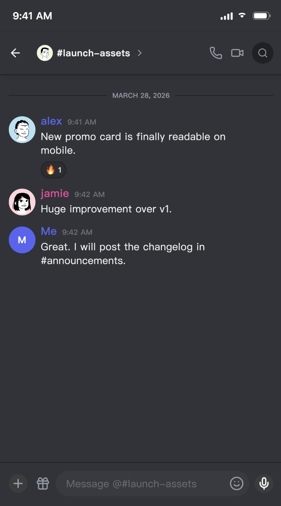
At the same time, Discord has redesigned the layout around the chat experience, giving the bottom of the screen more breathing room and bringing the mobile interface closer to the desktop experience.
It isn't just a cosmetic update.
Discord is trying to make its different platforms feel like the same Discord.
What Is the Discord "Squircle" Refresh?
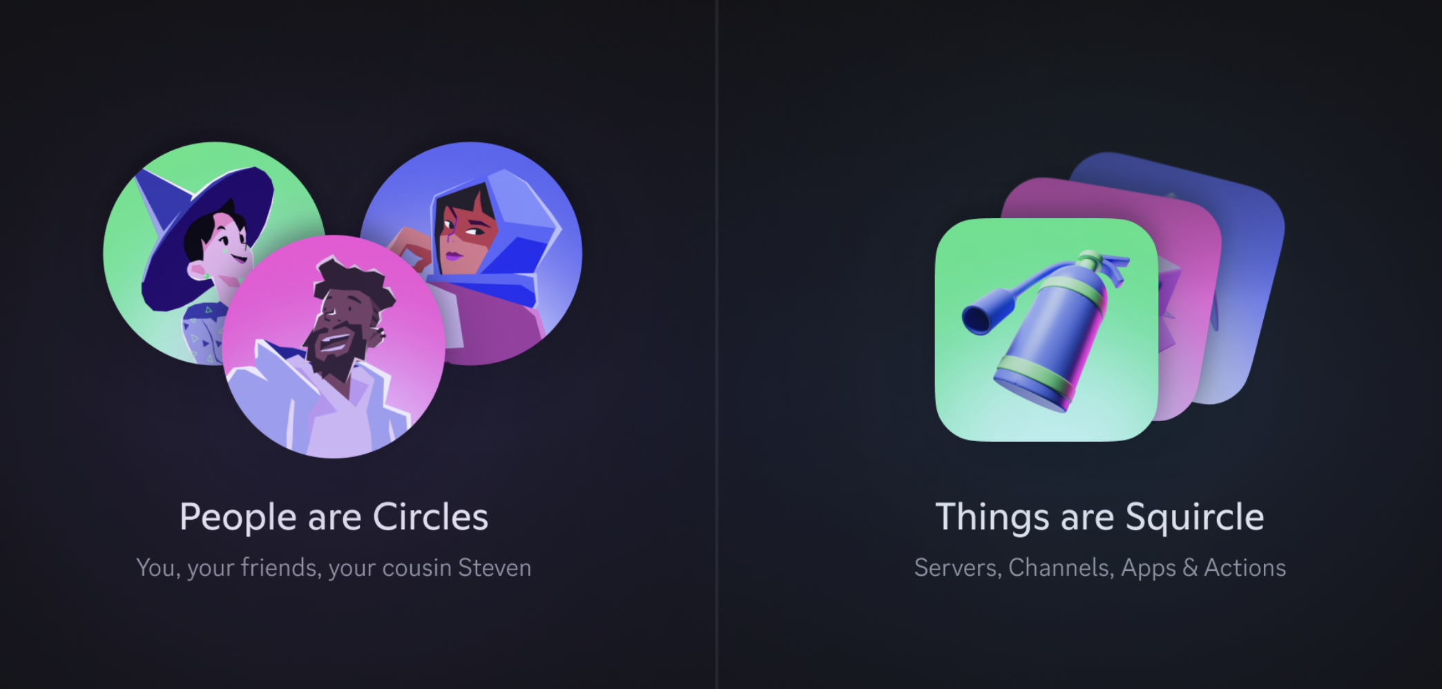
The "Squircle" name comes from one of the most noticeable changes in the redesign.
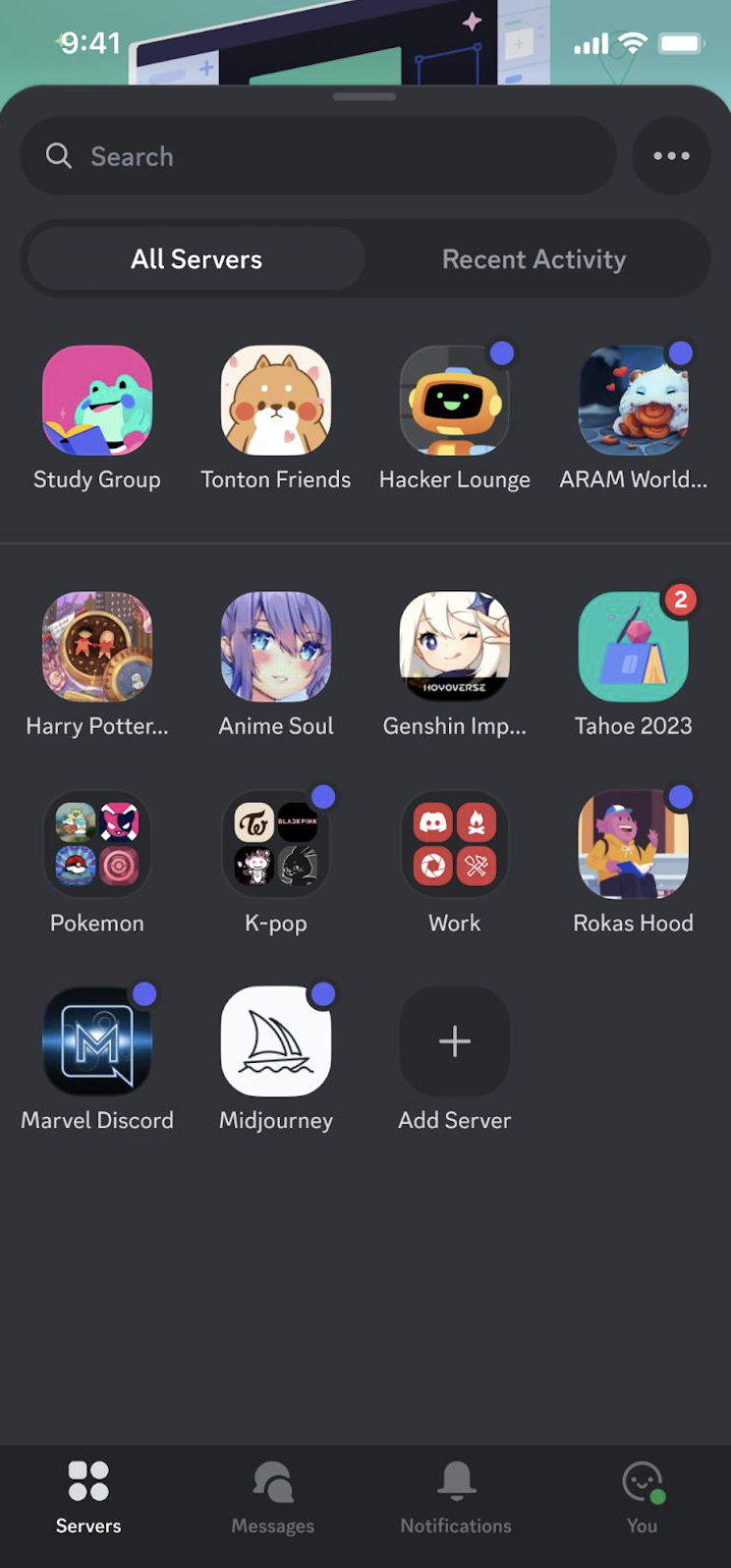
Discord's server icons are moving back toward a rounded-square shape, commonly called a squircle.
Alongside that change, Discord is bringing back:
- Circular user avatars
- The classic darker appearance
- More recognizable server icons
- A cleaner chat interface
- More space around the chat bar
- A mobile layout that feels closer to desktop
The result is a Discord that feels more familiar without simply copying the desktop application.
The OG Dark Theme Is Back
One of the biggest visual changes is the return of Discord's original dark aesthetic.
Discord's newer interface introduced more visual changes over time, including different shades, spacing and interface elements.
The refreshed mobile design puts more emphasis on the darker appearance that longtime users associate with Discord.
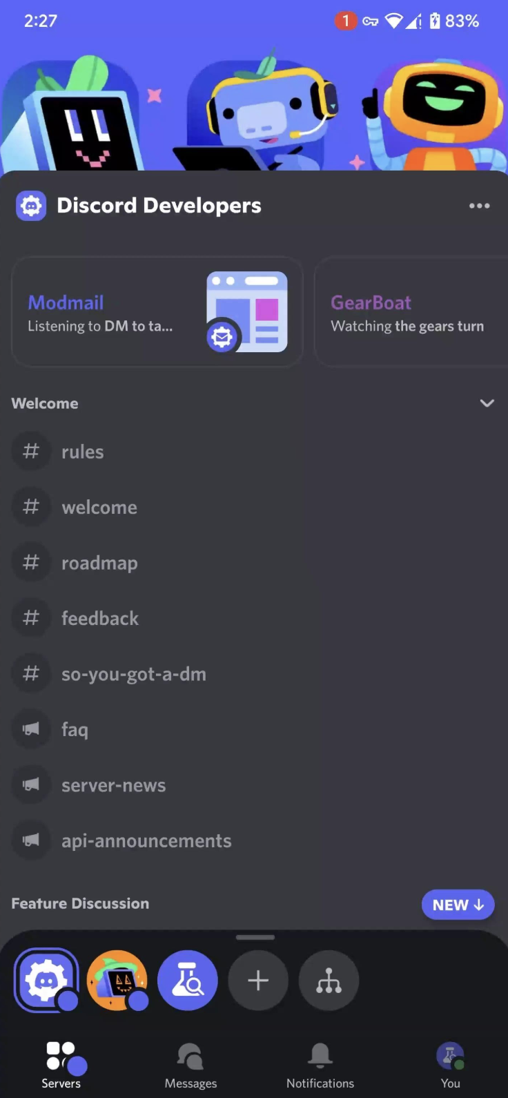
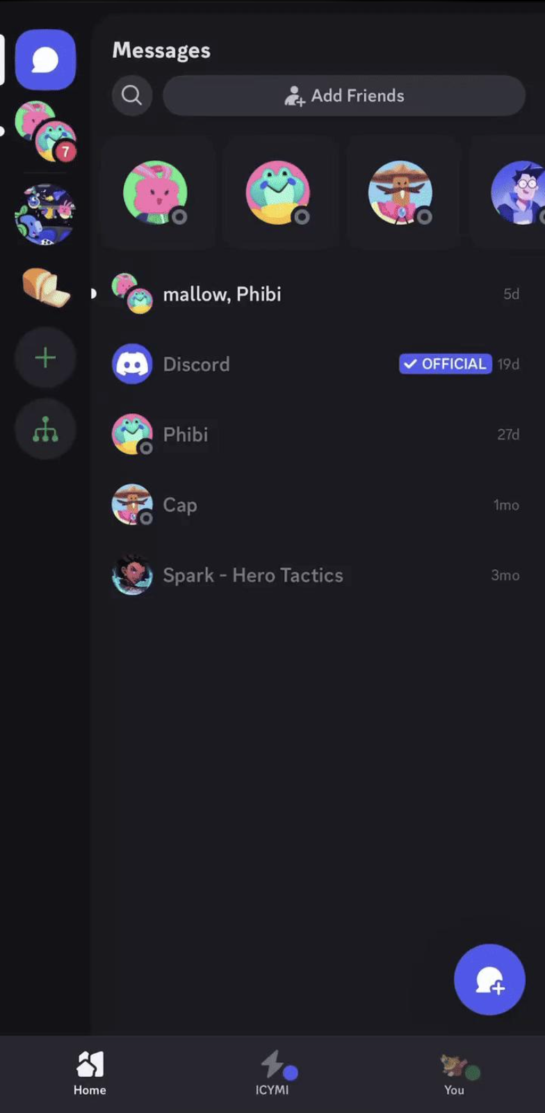
The darker interface also helps the colorful server icons and profile pictures stand out more clearly.
It's a relatively small change on paper, but visually it makes the app feel much closer to the Discord many users remember.
Circular Avatars Are Back
Another immediately noticeable change is the return of circular user avatars.
Profile pictures are one of the most recognizable elements of any social platform.
Discord's mobile redesign puts them back into a more traditional circular format, which makes conversations easier to scan.
You can quickly distinguish between:
- Different users
- Messages
- Profiles
- Conversations
without the interface feeling overloaded with different shapes.
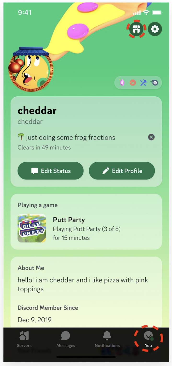
So, Why "Squircle"?
The server list is where the redesign becomes especially obvious.
Discord's server icons now use the familiar rounded-square/squircle shape instead of the more aggressively circular treatment used in some recent designs.
That creates a useful visual hierarchy:
Circular avatars = people
Squircle icons = servers
It sounds incredibly simple, but shape is an important part of interface design.
When different objects have clearly different shapes, your eyes can identify what you're looking at faster.
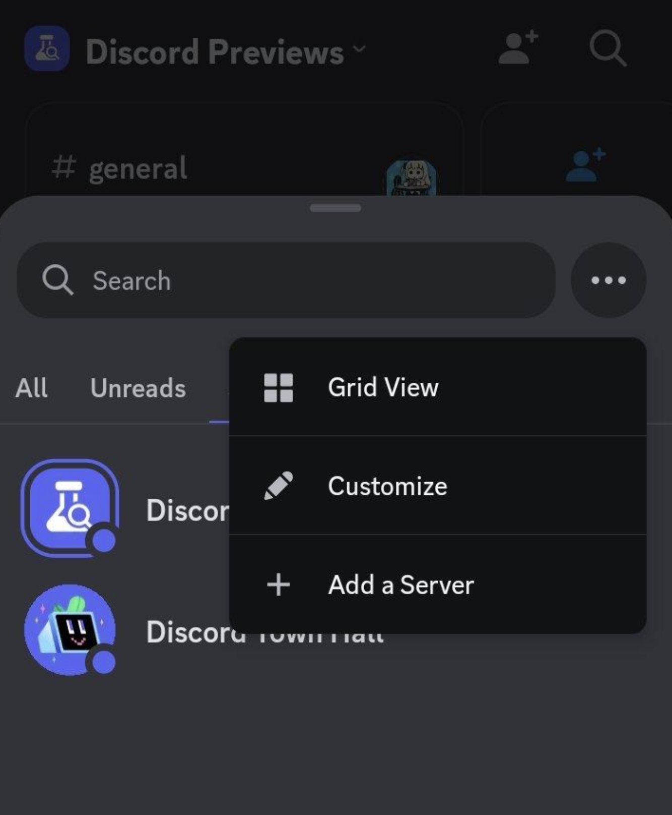
The Chat Bar Finally Gets Some Breathing Room
This might be the most practical part of the redesign.
The bottom of a Discord conversation can become crowded on mobile.
You have the message field, attachment controls, emoji controls, voice options and other interface elements competing for space.
The refreshed layout gives the area around the chat bar more breathing room.
Instead of making everything feel tightly packed against the bottom of the screen, Discord has adjusted the spacing and proportions to make the conversation feel less cramped.
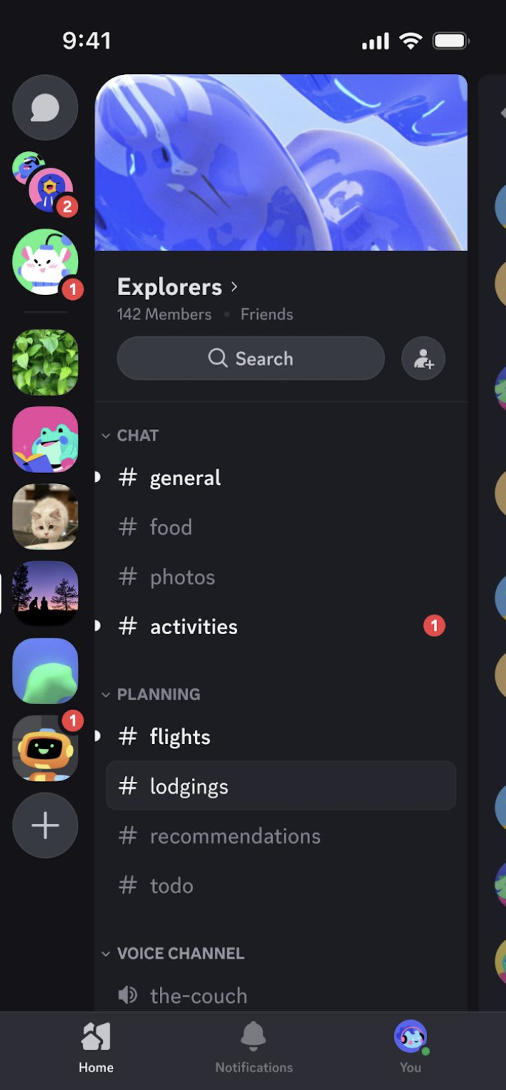
Mobile Discord Is Getting Closer to Desktop
This is ultimately what makes the redesign interesting.
Discord isn't trying to make mobile and desktop completely identical.
They still have different screen sizes and different interaction models.
Instead, Discord is trying to make the visual language consistent.
That means users can move between:
Desktop → Mobile → Desktop
without feeling like they've opened a completely different application.
The same general shapes, colors, navigation concepts and interface hierarchy carry across platforms.
That's what Discord means when these updates talk about creating greater consistency between desktop and mobile.
Why Desktop Parity Actually Matters
For years, Discord users have effectively had two different experiences.
Desktop Discord is designed around large screens, sidebars and persistent navigation.
Mobile Discord has to compress all of that into a much smaller display.
That naturally creates differences.
But visual consistency still matters.
Imagine using Discord on your laptop during the day and switching to your phone while travelling.
If the server icons, avatars, colors and navigation suddenly look completely different, you have to mentally adjust.
A consistent design reduces that friction.
The Redesign Is More Than Nostalgia
It's easy to look at the return of circular avatars and the darker theme and call this a nostalgia update.
But there's more happening here.
Discord is combining familiar visual elements with a more modern layout.
That's important.
Simply recreating the old Discord wouldn't solve the problems of a modern mobile application.
The goal is closer to:
Old visual identity + modern mobile usability.
And that's probably the strongest part of the redesign.
Discord Is Also Simplifying the Visual Language
Modern apps often suffer from the same problem.
Every update adds another button, another shape, another menu and another visual treatment.
Eventually, the interface becomes harder to understand.
Discord's mobile refresh takes the opposite approach.
The design uses a smaller number of recognizable visual patterns.
People
Circular avatars
Servers
Squircle icons
Conversations
More open chat layout
Overall interface
Dark, familiar Discord aesthetic
That makes the application easier to visually scan.
What This Means for Longtime Discord Users
If you've used Discord for years, the new mobile app may feel strangely familiar.
That's intentional.
The redesign brings back visual elements associated with older versions of Discord while keeping the conveniences of the modern application.
For newer users, meanwhile, the changes should simply feel like a cleaner and more consistent mobile interface.
That's probably the best outcome Discord could have aimed for.
Is the New Discord Mobile Design Better?
That ultimately comes down to personal preference.
Some users will love the return of the classic Discord look.
Others may prefer the previous mobile interface and consider the redesign unnecessary.
But there is one thing that's difficult to argue with:
Discord's platforms now feel more connected visually.
And that's important for a service where people constantly move between desktop and mobile.
🎮 The Bottom Line
Discord's mobile "Squircle" refresh isn't just about changing the shape of server icons.
It's a broader attempt to bring the mobile application back toward Discord's recognizable identity while making the interface more comfortable to use.
The OG dark theme, circular avatars, squircle server icons and roomier chat bar all contribute to the same goal.
Make Discord feel like Discord again.
But this time, make the experience work better on a phone.
And if Discord continues in this direction, the biggest win might not be nostalgia at all.
It could be finally making desktop and mobile feel like two versions of the same product.
What do you think?
Do you prefer Discord's new Squircle redesign, or did you like the previous mobile interface better?
Comments
Sign in to join the conversation
Sign inNo comments yet
Be the first to share your thoughts!